Dépannevélo
0 → 1 app connecting riders to mechanics
Two-sided marketplace connecting cyclists with nearby mechanics, on demand, from MVP to full product.
Cyril Vescan — Product Manager
Adrian Burlău — Product Designer
Cyril Vescan — Product Manager
Adrian Burlău — Product Designer

A broken bike shouldn't mean a broken afternoon
Dépannevélo is an on-demand bike repair app connecting riders in France with certified mechanics who come to them, wherever they are.
I led the product design at agenceTIZ, working on user flows, information architecture, and full UI/UX for both sides of the marketplace. After the MVP shipped and the client stepped back, I continued the project independently, taking it from a functional but incomplete MVP to a fully mapped product.
Cycling grew faster than the infrastructure around it
France's cycling infrastructure hasn't kept up with its cycling boom, but getting a bike repaired quickly and reliably is still a painful, unpredictable experience.
Dépannevélo exists to close that gap.
Bike usage nearly doubled between 2019 and 2023 across French cities.
of French people who cycled at least once in 2023.
Of all trips in Strasbourg, Paris, Lyon, and Marseille are now made by bike.
Two users, one product, no room to favor either
This is a two-sided marketplace. Both the rider and the mechanic are users, and both have to be served well, or neither comes back.
The rider needs speed and confidence. The mechanic needs clarity and trust. Every design decision had to balance both, because simplifying one side often creates friction on the other.
Keeping both mental models alive throughout the entire product was the core design challenge.
Fast for one side. Slower, on purpose, for the other
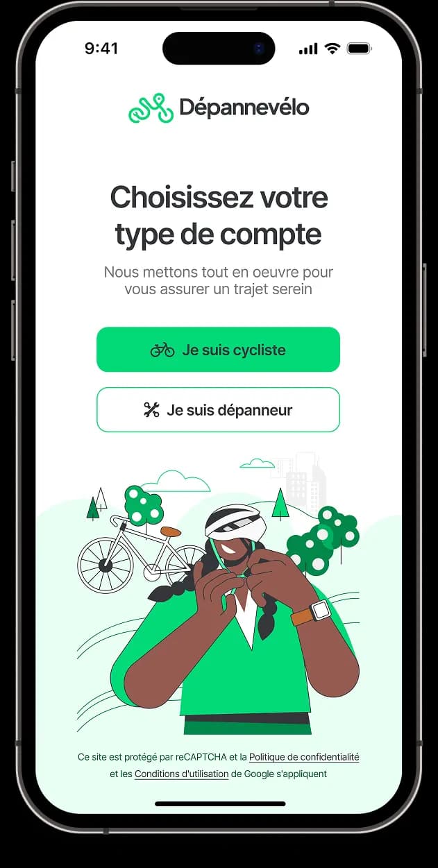
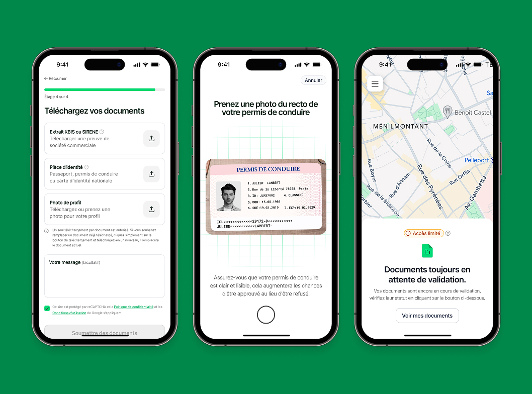
Rider onboarding is fast by design, mechanic onboarding is deliberately slower. Both are correct for the trust each side needs to earn.
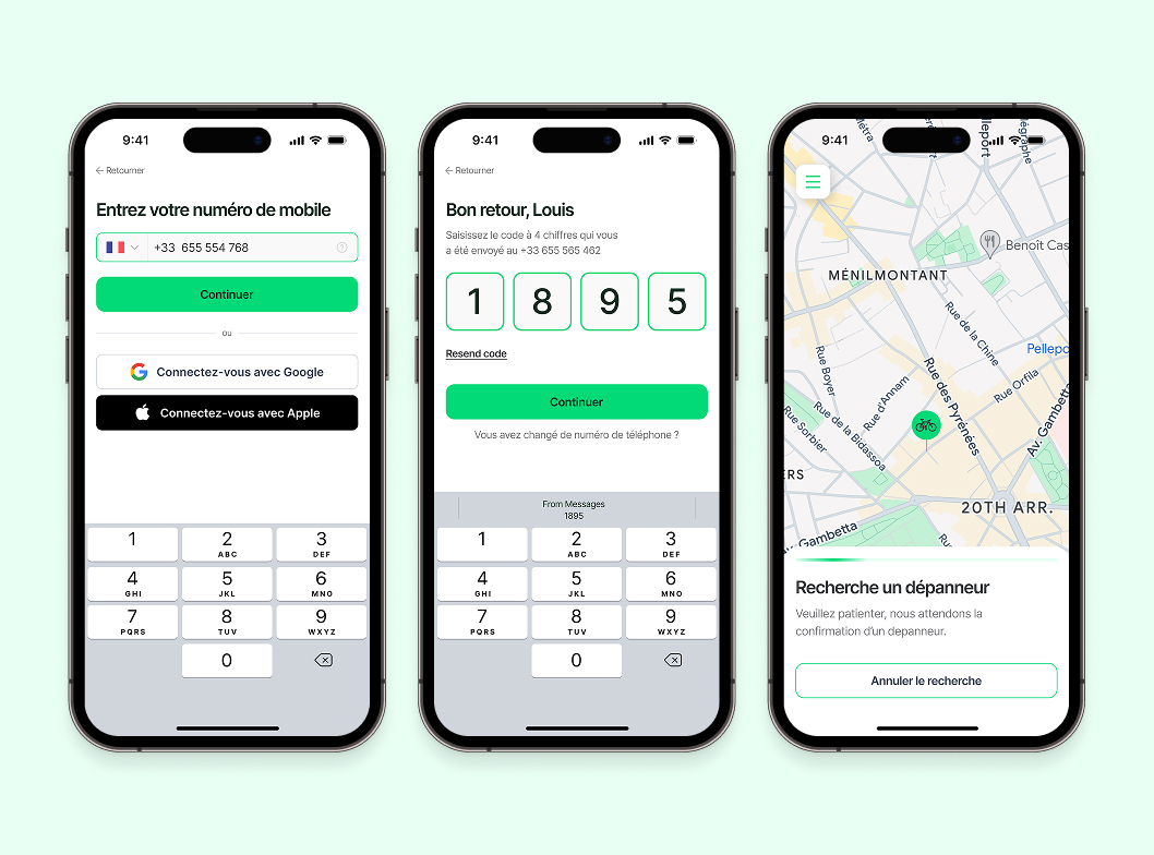
In the map, under 3 minutes
Phone number, bike profile, plan selection, done. A rider with a broken bike doesn't have patience for friction.
Deliberately slower
ID documents, driving licence, experience, profile photo. A rider calling a stranger to fix their bike needs to know that they've been vetted.
The core loop
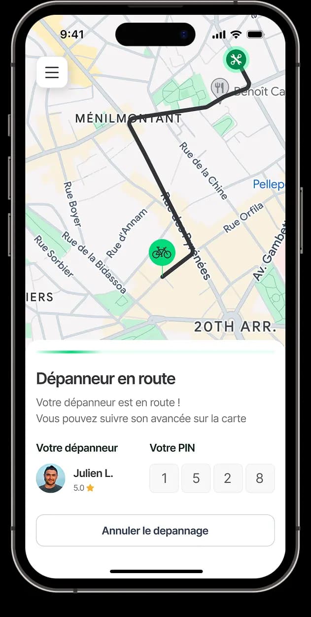
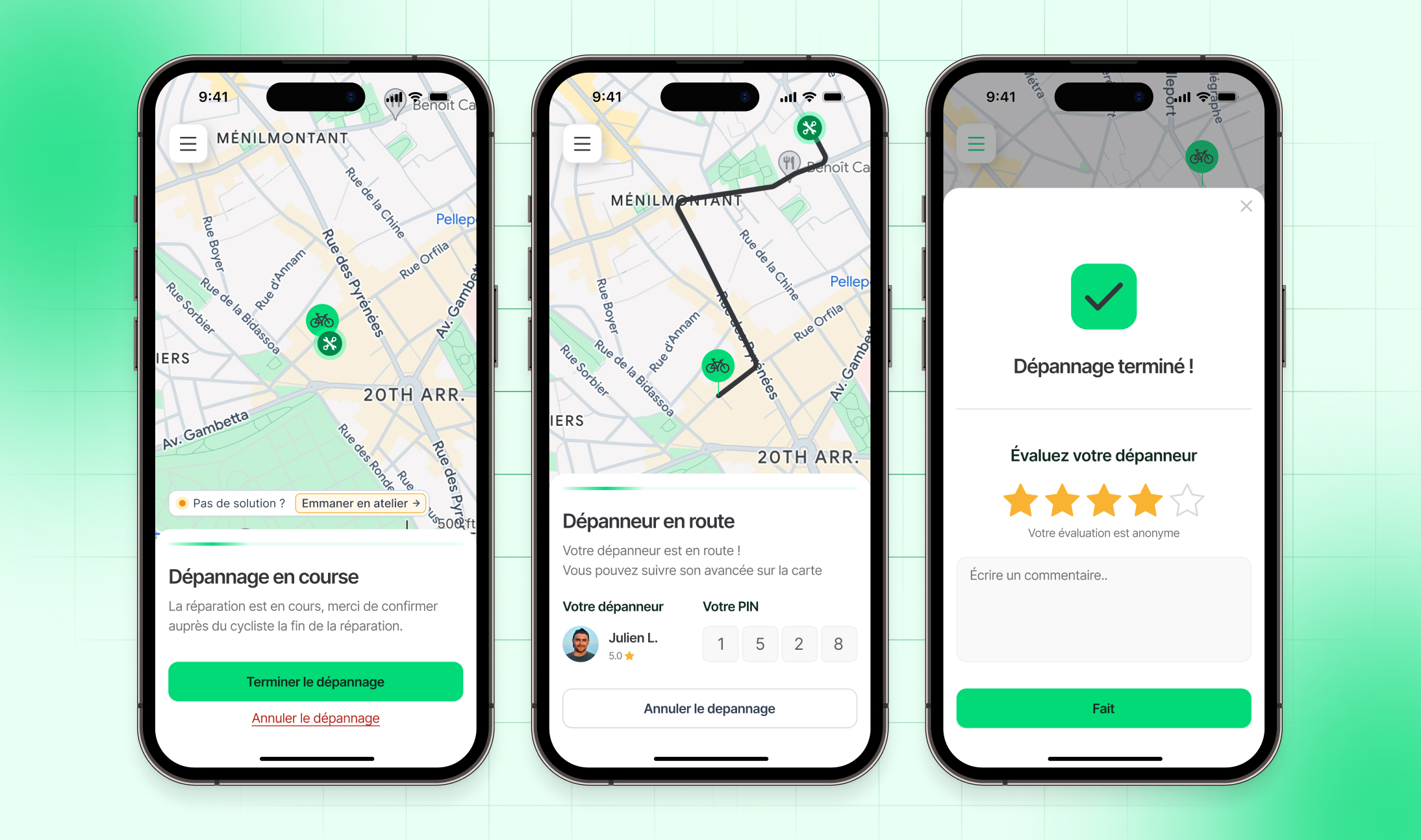
Once onboarded, both sides move through the same underlying loop: request, match, repair, confirm. All being built on the ride-hailing mental model described in Research below.
From raw count to contextual model
With a limited budget, we focused on what was available: market data on cycling growth across French cities, and a close study of ride-sharing apps that had already solved two-sided real-time matching.
We didn't have budget for user interviews. The MVP served as our real-world validation, it launched, attracted users, and proved the demand was real.
Features
Inside the box
Not in this market at all. Studied for patterns already solved: two-sided real-time matching, live tracking, mutual trust confirmation.
None of it copied directly: the PIN system alone took Uber's idea and rebuilt it for a completely different kind of risk.

Inspiration
Dépannevélo works like a ride-hailing app, but for bike repair.
Key decisions
Confirmed, not assumed
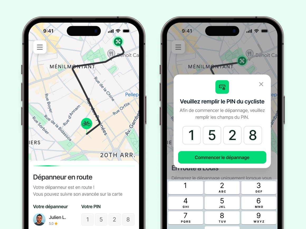
When a mechanic arrives, the job doesn't start and no credit is consumed until the rider hands over a unique 4-digit PIN. This prevents ghost completions and creates a clear mutual confirmation moment before anything is committed.
The reference was Uber's name-verification system, adapted for a context where the real risk isn't physical safety but financial trust.
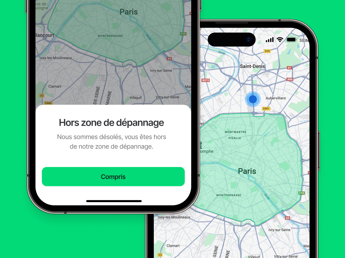
Honest expectations
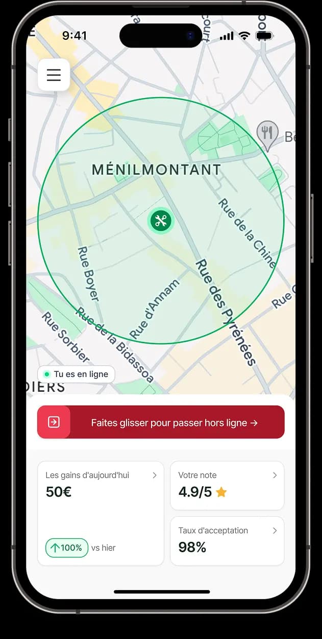
Mechanics work within a defined radius. Riders outside that zone are told immediately, not after waiting for a match that won't come. Honest expectations prevent abandonment.
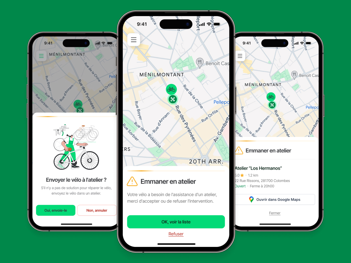
No dead ends
When a mechanic can't fix the bike on the street, the app surfaces nearby certified ateliers: distance, hours, rating, rather than ending the session with a dead end. The rider stays in the product even when the job can't be completed on the spot.
Completing the product, not adding to it
The MVP proved the concept worked. The core loop: request, match, repair functioned. What it lacked was everything around the loop.
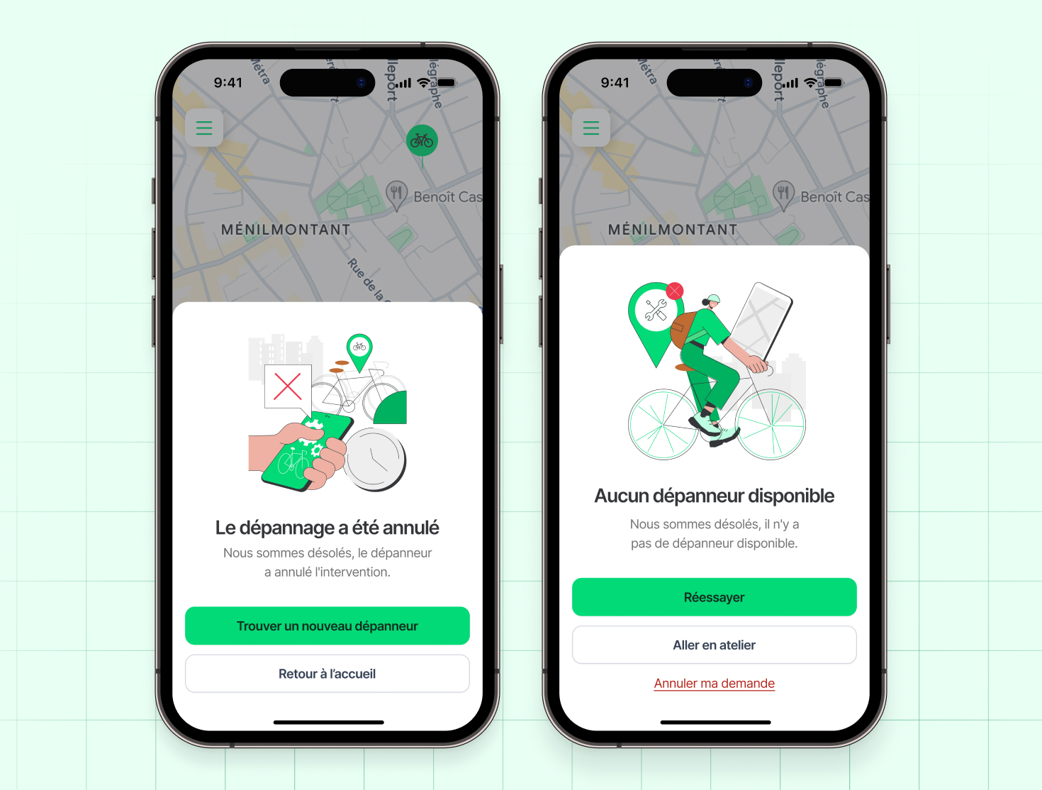
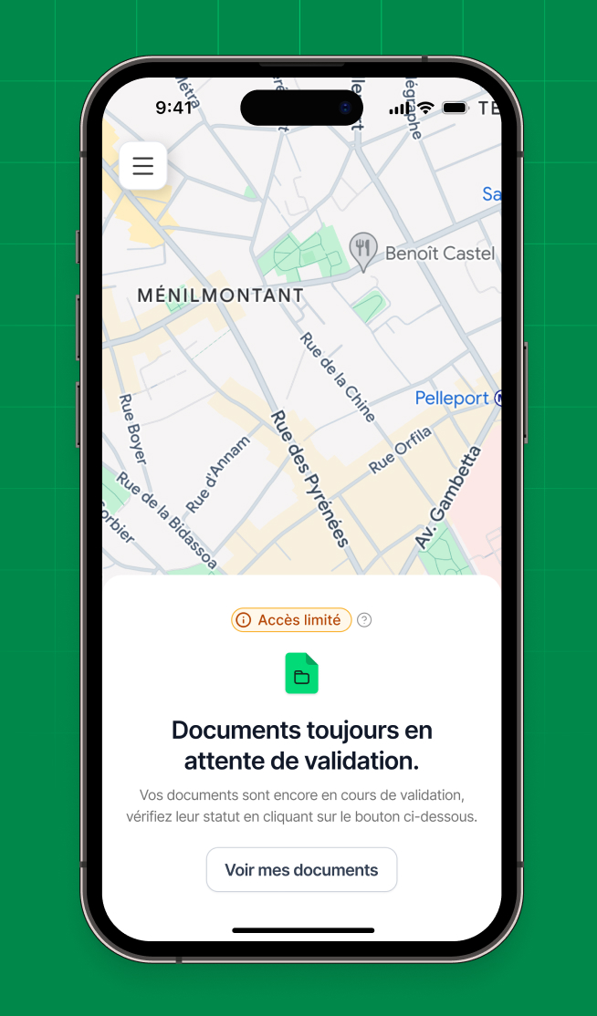
Complete flows, edge cases, error states, account management, cancellation paths, mechanic document management, none of it existed yet. I did it independently, part-time, because I believed the product was worth finishing properly.
V2 wasn't about adding features. It was about completing the product, mapping every state and every decision point so that nothing leads to a dead end.
Trade-offs made along the way.
The agency's budget didn't cover user interviews, so we studied adjacent apps and let real-world usage validate instead. It worked, thousands of downloads within weeks. But that validation never led to a next phase, where the engagement ended once initial deliverables shipped and no structured research has happened since.
Budget meant serving riders and mechanics inside a single app, rather than splitting them the way Uber separates rider and driver apps into two distinct products. That split would have suited two very different mental models better, in an ideal, better-funded version of this.
Cyclofix was the only close comparable at the time, and it changed its own model mid-project: from on-demand to scheduled booking, leaving little real-world reference to check assumptions against. A real constraint then, in hindsight, also a sign of how open the space still was.
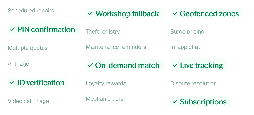
Nothing here was designed and then rejected. Roughly 20 features considered, most were deliberately left out, mirroring the constraints a real product team works under, not because they failed. PIN confirmation and geofencing made the cut for addressing trust and expectations directly, the rest waits for next phases.
Polish isn't cosmetic
The gap between something that works and something that feels considered is where most of the real design work lives. The MVP was functional from day one, but without complete flows and a coherent UI, it still felt unfinished.
V2 taught me that polish isn't cosmetic, it's the difference between a product people trust and one they tolerate.